Customizable UI
Make the wallet
feel native.
Drop-in components, dashboard-tuned themes, or fully headless. Pick the level of control you want.
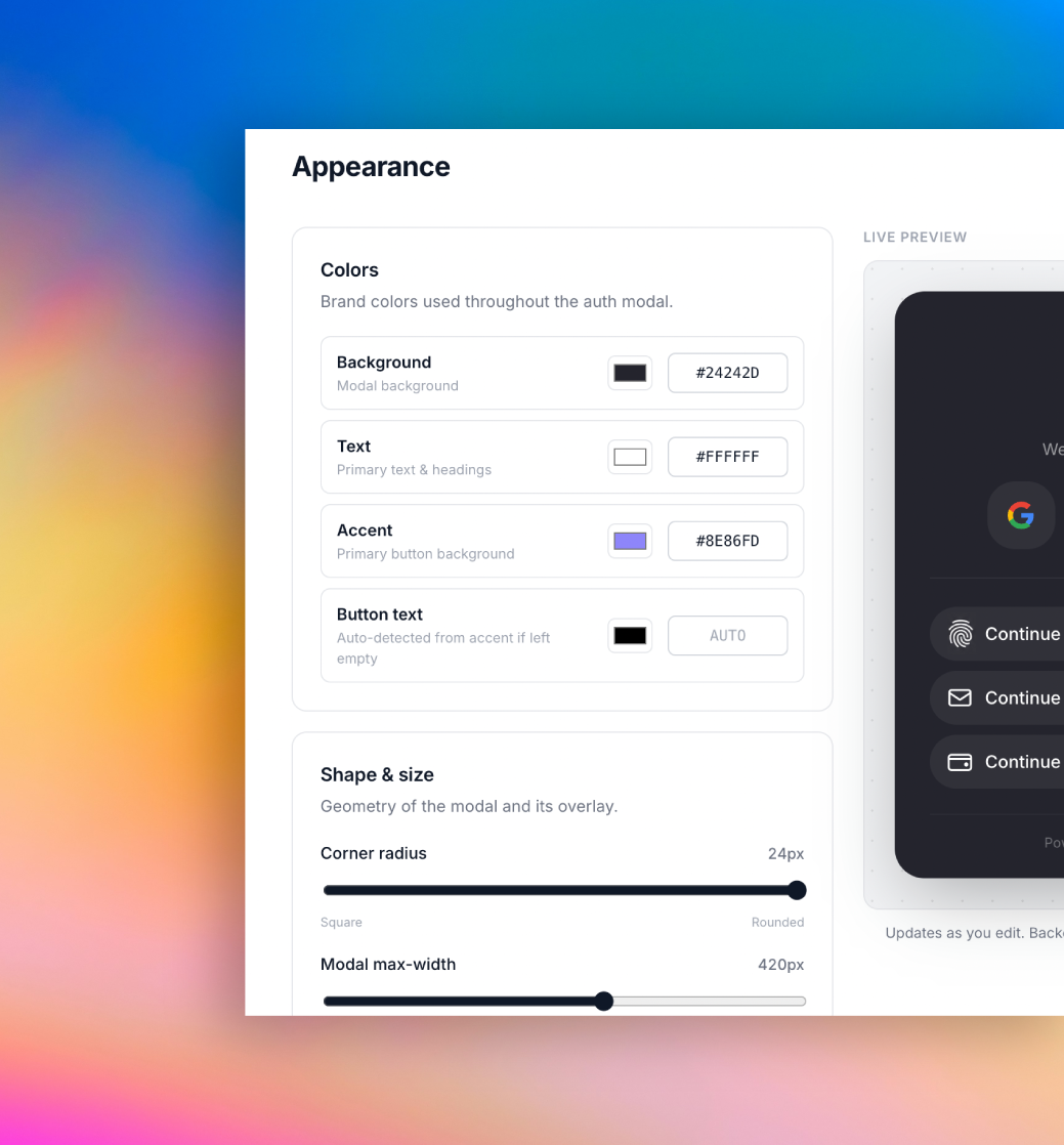
Theme tokens, dashboard-driven.
Set brand color, radius, fonts and logo from the portal. Your SDK modal reads the latest project configuration.
- Brand colors and typography
- Radius, density and shadows
- Powered-by controls on eligible plans
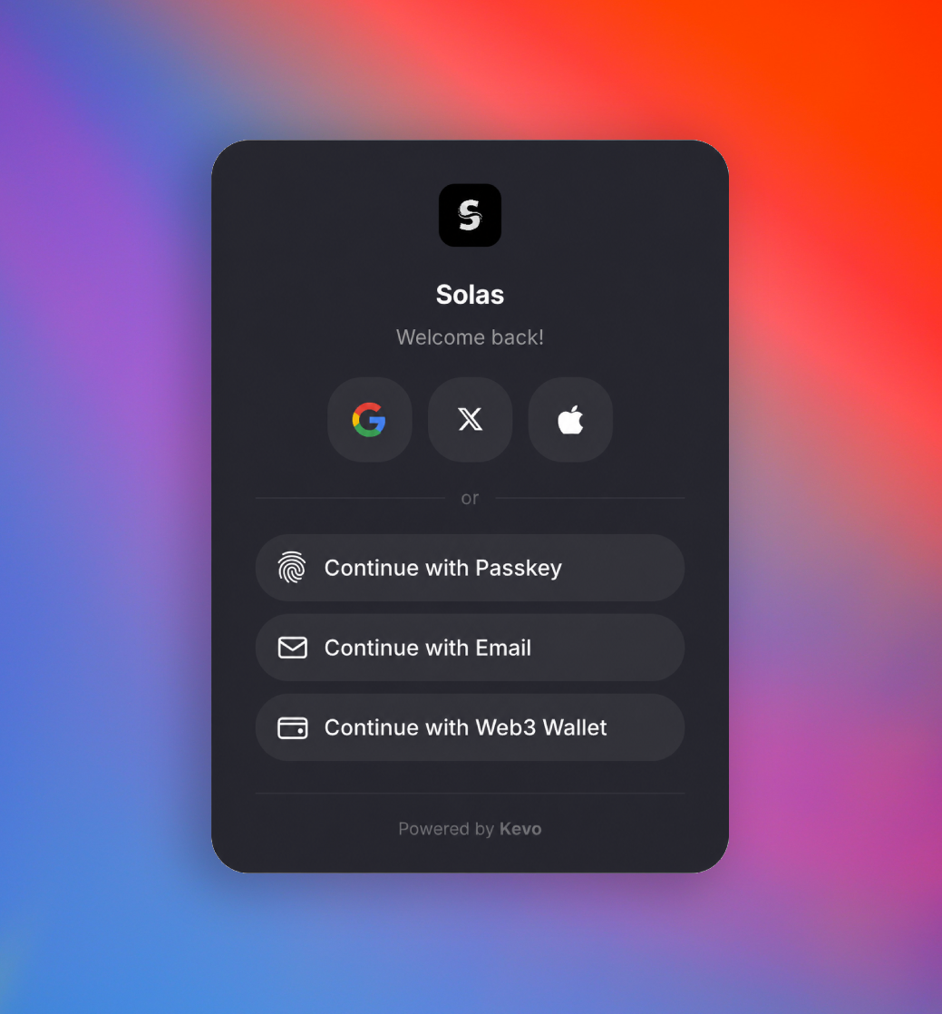
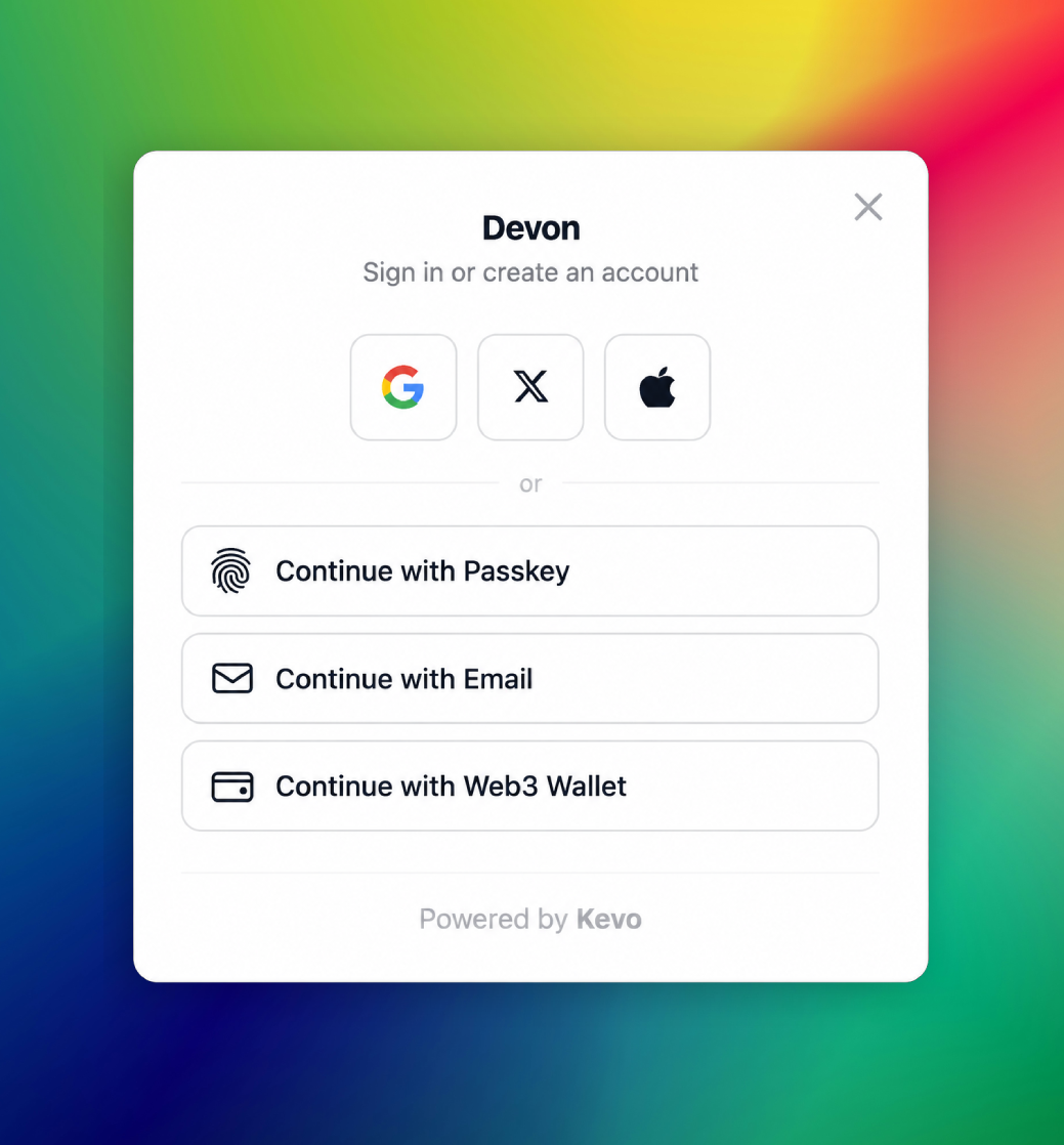
Drop-in components, fully branded.
Use the prebuilt sign-in modal, wallet card and send flow with a single import. They inherit your theme and ship with sensible defaults.
- <KevoModal /> for sign-in
- Account dashboard and wallet controls
- Light, dark and system themes
SignIn.tsx
import { useKevo }
  from '@kevo-ws/sdk/react'

const {
  isAuthenticated,
  loginWithGoogle,
  sendEmailOtp,
  verifyEmailOtp,
} = useKevo()

<button onClick={loginWithGoogle}>
  Continue with Google
</button>
Or run Kevo fully headless.
Skip the UI entirely. Call the hooks, render your own components, own every pixel. Auth, wallets and signing still come from Kevo.
- React hooks for every flow
- Client and server SDK primitives
- No CSS shipped, no markup forced
Your brand
A wallet UX that disappears into your product.
From dashboard tuning to fully headless, Kevo bends to fit your design system.